HotSchedules’ primary focus is on back-office tools, scheduling, and labor management for Managers and above. The mobile app has always had a limited feature set for the hourly employee. For these users, the functionality of the application provides only three things:
- View Schedule
- Request Time Off
- Pick up, Release, or Swap shifts
The Ask
I was excited to see a new feature effort for the hourly employee called MyPay. It was frustrating to groom the details with a Product Manager who lacked inspiration and imagination and had already decided what they believed to be the best solution.

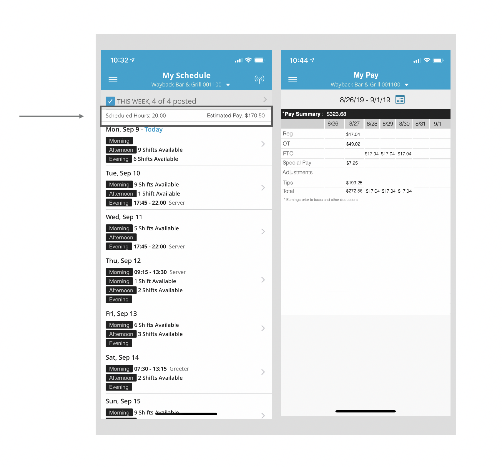
The idea was to add an "Estimated Pay" field above the schedule that displayed the total scheduled hours for the week multiplied by the base rate of pay.
Sometimes the real challenge is convincing the Product team that it is worth doing the work to build meaningful experiences that will address the user's goals and motivations.
It's a battle worth fighting. It is especially true if it feels like a product is releasing features for feature's sake.
The Challenge
What is the problem we are solving for? The user story attached to the image above was:
“As an employee I would like to know how much money I may earn for either my scheduled or worked hours so I can pay off my student loan debt”.
Sometimes identifying the problem is problem-solving. Then the challenge becomes articulating this to the team. It is truly a difficult challenge when the Product Manager already has a prescribed solution in mind.
I would have to work fast to identify the business goals and put them in the context of the user experience.

Product: Vision & Opportunities
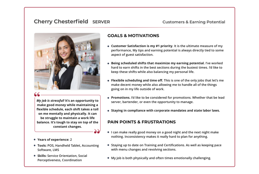
I leveraged current functionality and highlighted the goals and motivations of the users. I identified business goals in the context of opportunities for enhancing the feature for the hourly employee.
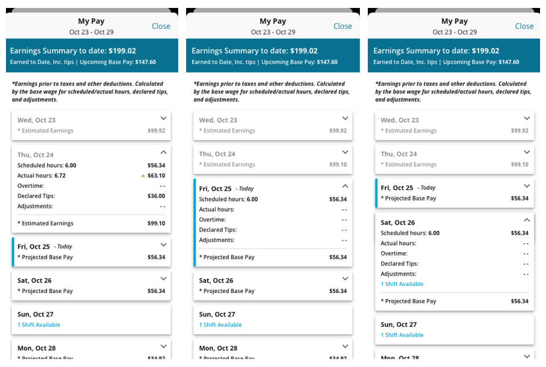
- Gain insight. Provide more accurate earned wage totals through tip declarations, adjustments, and overtime earnings.
- View Impact. Surface the above data points in context of Scheduled hours vs. Actual hours so a user can compare “earned to date” totals with “upcoming base pay”.
- Take Action. Display any “Available Shifts” for pickup for each day so a user can immediately take action if they are falling short of their earning goals.
Because these touchpoints are existing functionality advocating for a more meaningful solution did not necessarily affect the scope of the project.
Discovery
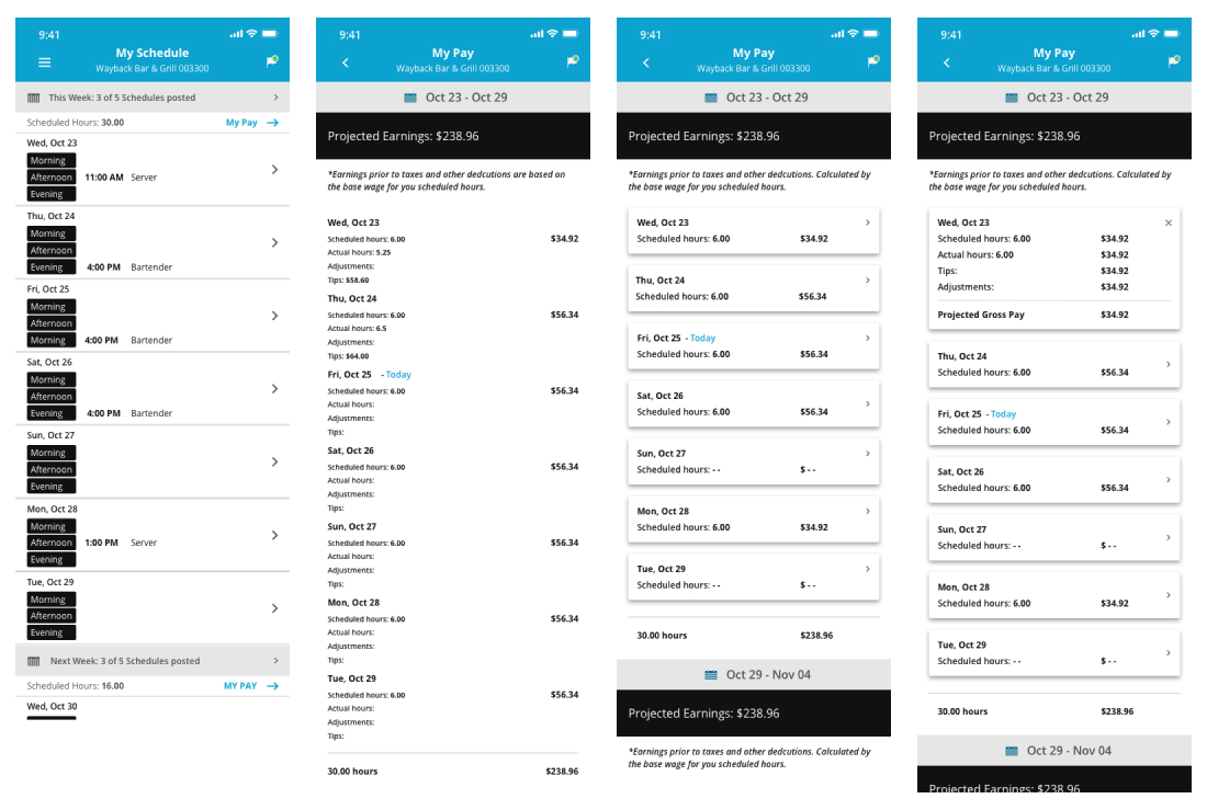
I quickly built wireframes that visualized key concepts for feedback from developers. It would be an integral talking point for a conversation with the PO and PM. It helped articulate a vision and had the support of buy-in from the development team with an accurate estimate of constraints and scope.

I collaborated with the PO and lead engineer to determine a high-level estimate or "t-shirt size". It would be a great way to align the Product Manager on why we should build a more robust feature that would more effectively address business goals and the goals and motivations of the user, and that we could.
Iteration
While I facilitated these conversations with the Product Team, I organized design critiques and got feedback on the initial direction of my earlier designs.

A few key decisions:
- Modal Sheet vs Page. I want the user to focus on the information and insight to inform decisions and take action without losing their place.
- I surfaced the most relevant data points at the top of the sheet. This vital information could be consumed at a glance.
- Lists & Tables vs Cards. Cards are more engaging, present the most important information up front and intuitively expand for more detailed information.
- UI refinements to help visually communicate what a user can do, where we are in the week, current day, upcoming days and past days.
The Results
I worked with the entire Product team and effectively articulated why we should invest in a dynamic feature with direct benefits for the end-user rather than simply shipping something like an empty placeholder for nebulous future initiatives.
The feature was shipped and released. Several large clients including, Chik-fil-A, enabled the feature so their employees could take advantage of the earnings insights.
My efforts to build a more meaningful feature and surface it through an engaging user experience became the foundation for a net new EWA (Earned Wage Access) product recently developed and launched in early 2022. MyPay ended up being the core of this new product and the entry point for its introduction.
