
HotSchedules shifted focus to mid-market and national enterprise-level clients. How can we continue to provide a solution for smaller businesses and the local space?
The "Essentials" product provides a self-service subscription. Customers can utilize core features of the product without the need for Implementation or Training.
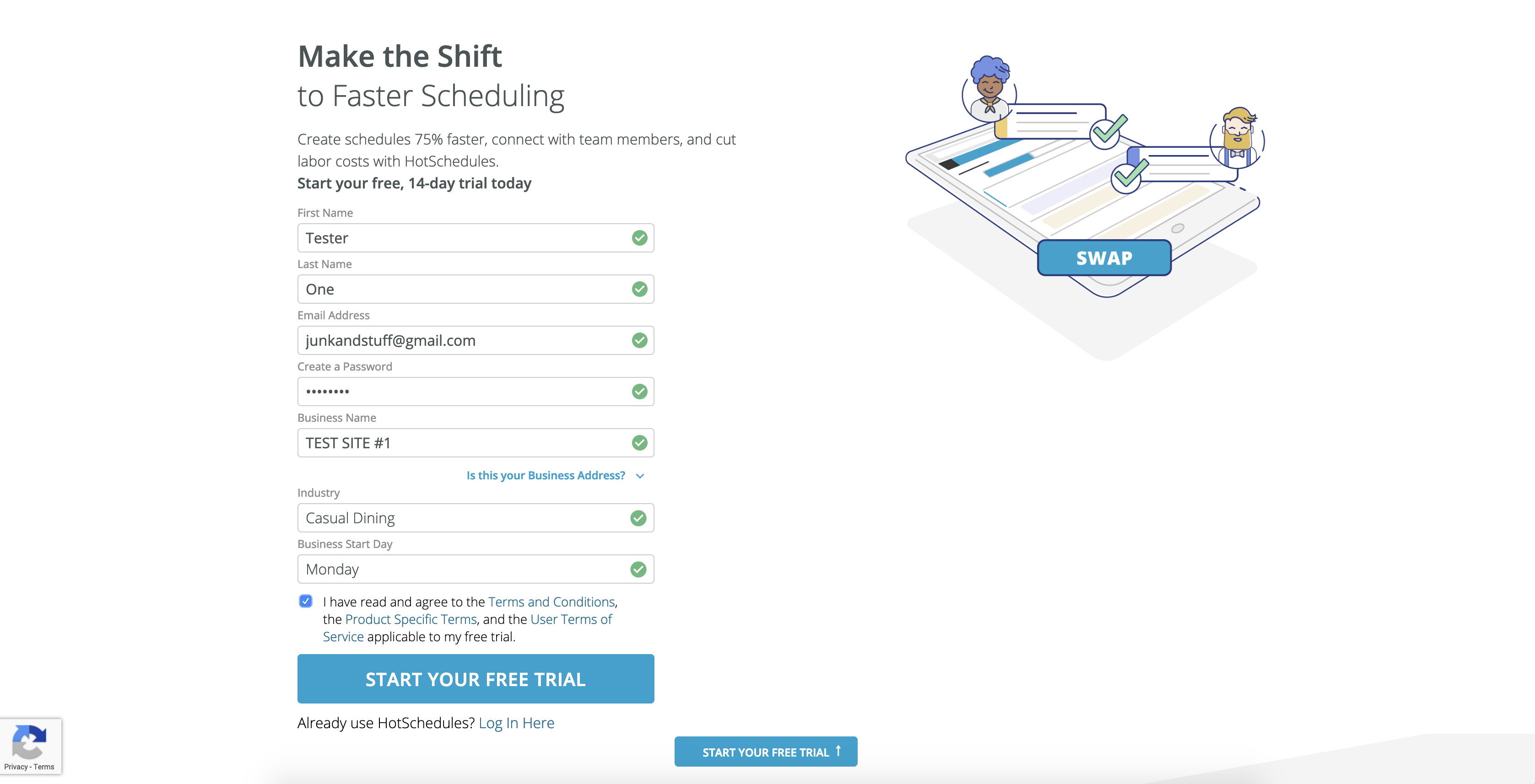
After completing a relatively simple process of starting a free trial, the user landed on a powerful and complex platform that required a series of complicated setup steps to be completed before the site provided basic functionality.
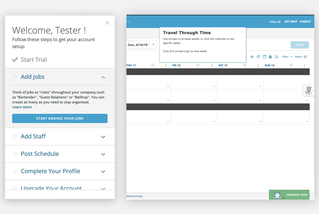
The user accomplishes the setup by accessing a "Set Up Panel" that surfaced links to WalkMe tutorials.
The Challenge
How can we improve the setup process for a first-time user who has landed on a platform that requires a lot of navigation and input before even base functions and tools are available?
A business that has signed up for a Free Trial of the Essentials platform must realize the ROI quickly to justify investing further in the solution. A poor experience that guides users through steps that typically require implementation and training services prevented users from immediately seeing the value.
The Business Goals
The business defined specific KPIs that validated the Essentials product as a revenue-generating arm of the company. As well as the MRR realized from free trial to paid subscription, the self-service platform acts as a vehicle to capture Pre-qualified Leads (PQLs) for the sales organization. There is 3 actions the Essentials product used to measure success:
- A user creates and posts a schedule.
- Another user is added to the site and logs on.
- A conversion from Free Trial to Paid Subscription.
Initial Improvements
I conducted an extensive audit of the existing experience for a first-time user.

Complex setup steps facilitated with the WalkMe digital adoption platform were a huge barrier for people who needed to quickly implement a self-service platform that addresses their scheduling and labor management needs.
Discovery & Insights
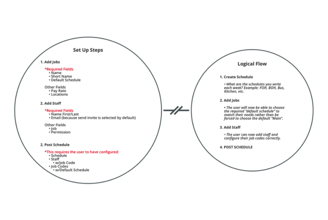
When I began exploring how to improve the setup panel and WalkMe experience, I noted a logistical error surfaced in the steps of the existing user flow. The order of setup actions for an Essentials user did not reflect the logical flow of how we implement and set up our sites with enterprise-level customers.
The steps in the setup panel were a collection of mutually dependent actions that require data from previous inputs that are necessary to complete any following steps. For example:
Configuring a job requires you to select a default schedule. But if the user has not yet configured any Schedules, the user is forced to exit the jobs modal and begin the user flow for configuring Schedules.
A Lightbulb Moment
Improvements to the in-site tutorials were necessary. However, there's an opportunity for a user to input the required setup data immediately through an active and dynamic onboarding experience.
I pitched this to the team and started looking for inspiration to determine an approach to this direction.
Competitive analysis of several onboarding experiences of many different applications and platforms provided great examples. With inspiration and our business goals in mind, I outlined the key objectives I would focus on for designing a solution that would embed core setup actions in a simple, engaging, and interactive onboarding experience:
- Keep it simple.
- Focus on user control and freedom.
- Provide effective feedback.
- Create delight.
Exploration
I distilled steps to the absolute minimum input required to capture the data needed to set up a site. I stripped the original modals of unnecessary fields and inputs and focused on steps users could complete and start using the product immediately.
These also turned out to be the steps that meet the business KPIs for measuring the success of the platform:
- Create default schedules.
- Create job codes.
- Add users.
Rapid Wireframing
I started with some quick wireframes and looked for feedback:
- User flow for adding multiple items.
- The Primary CTA or Continue button.
- The Messaging and copy.
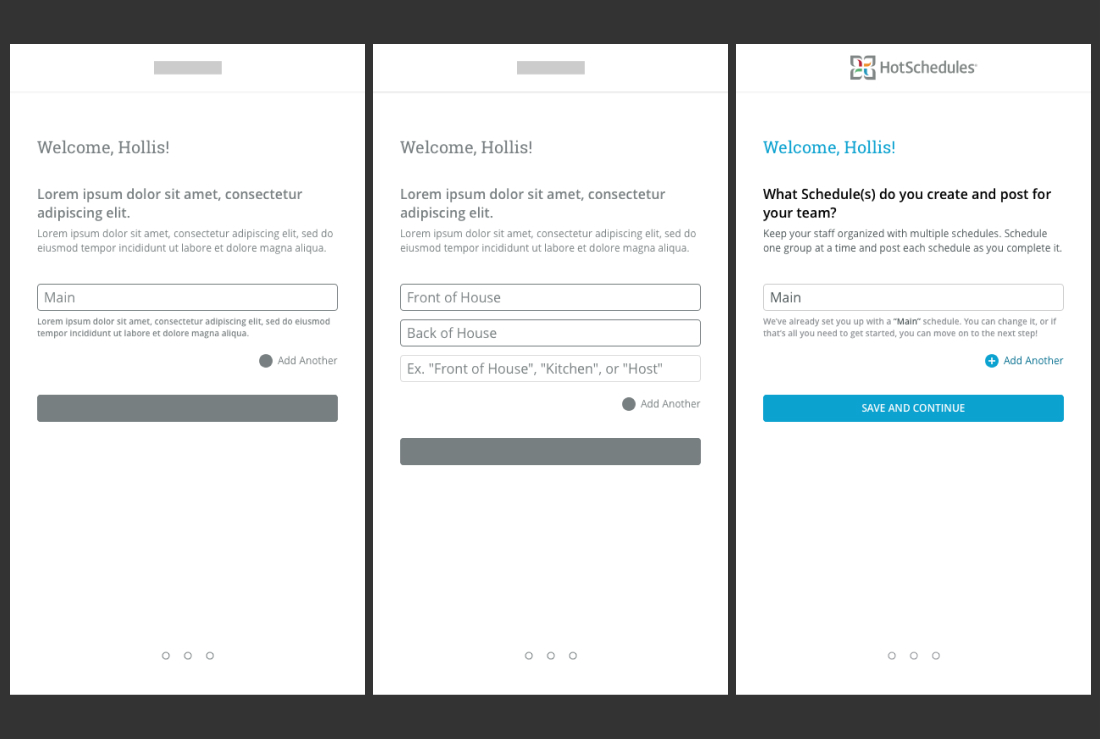
I moved the screens to a medium-fidelity and tested this direction using a clickable prototype.
Some things I got right:
- It's simple. There are only three steps. The steps are visible in the stepper at the bottom of the screen.
- It's effective. The user is inputting actual data necessary to set up their site.
- The copy is simple and easy to understand. It speaks the language of the user.
Some things I could improve:
- The "Add Another" floating text button is similar to the primary "Save and Continue" button. Are there constraints?
- User feedback isn't clear. The helper text and inline placeholder text are inconsistent.
- The experience doesn't provide freedom to control more of the experience for the user's unique goals.
Iteration
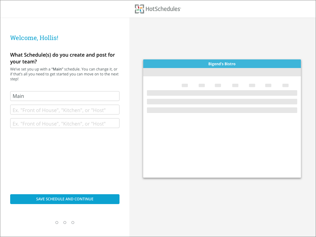
- Required limitations are clear while still improving user freedom and control. Users can choose to continue and use the default setting for this step.
- Eliminated unnecessary copy and provided clear direction for the user.
- More intuitive input fields.
Effective Feedback
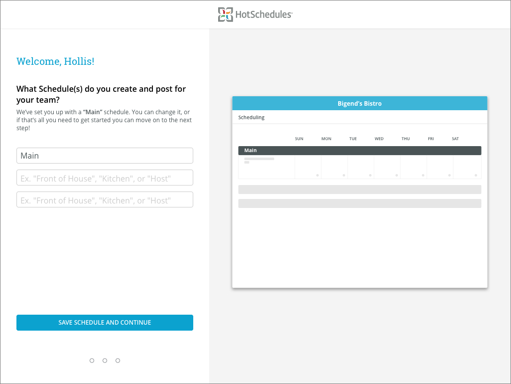
I challenged the team to think outside our current patterns and deliver a more engaging and dynamic approach to user feedback and success messaging for the Essentials onboarding experience.
On the onboarding pages, I designed a low fidelity wireframe that creatively accomplishes two things:
- Visually provides direct feedback of successful action by translating user input dynamically in the wireframe that mirrors the actual interface.
- Provide the user with visual clues of the product itself with primary elements like top-level navigation page headings and where the current inputs would surface once inside their site.

Following the logic I outlined earlier, the steps in the onboarding flow are dynamic. Because mapping to a default schedule is a requirement for creating a job, the user has those options available to choose from because they just configured them in the previous step.
The same experience is part of the final step. When adding an employee, they can immediately assign a job code they've configured in the previous step.

The Results
Measuring Success
The Essentials onboarding feature was released beginning of Q3 2019, and the success was measurable. Month to month from September to October the self-service Essentials platform saw significant growth in these areas:
- Gross Volume - +9.5%
- New Customers - +2.9%
- Successful Payments - +8.9%
- Net Volume from Sales - +10.0%
- Average Revenue per Customer - +1.3%
After the release, month over month from August 2019 to end of Q3 we tracked an upward trajectory overall:
- Gross Volume - +105.2%
- New Customers - +47.8%
- Successful Payments - +93.6%
- Net Volume from Sales - +104.1%
- Average Revenue per Customer - +8.0%
